Overflow menu in the Google+ update

Google+ received a major UI refresh today and, oddly enough, it called its sidebar full of tabs a ribbon. What’s nice about it, though, is that it features an overflow menu that uses drag-and-drop for customization, not unlike the one I’ve described some time ago.

See for yourself:

It’d be nice if LibreOffice implemented something similar

Making styling easy as π

When talking about UI reform, the thing I hear most is that hard formatting needs to die and everyone needs to be forced to use styles. While I don’t think hard formatting should be abandoned completely, I do think that styles are an underused feature. And it’s underused because it’s a hassle to use. Creating styles is hard, editing styles is hard, and even applying styles takes a considerable while longer than simply hitting that “bold” button up at the top.

So here’s my attempt at making styles simpler. It’s a series of mockups for the tablet, but it would work the same way on the desktop.

The style list is drastically slimmed down. Only the first member of ordered groups of styles (like Headings) is shown until that member is used in the document — e.g. once you use “Heading 1”, the list will also show “Heading 2”, and once you use “Heading 2”, the list will also show “Heading 3”, etc. The list is also shorter because paragraph and character styles have separate drop-down menus.

Adding styles and editing them is done right within the menu — there’s a toolbar up at the top. Pushing edit shows all the included styles:

Within the style editing dialog, there’s a “Pin” button and a text box for a textual icon. When pinned, this icon ends up in the style bar, a toolbar for pinned styles that floats above a selection. It makes getting to commonly-used styles easy, easier than to Bold or Italic with a mouse, because a mouse has to cover less distance to reach these style buttons:

Looking forward to feedback. :~)

A basic Android mockup

Hi everyone,

I know it’s been a while since I wrote something here, and I’m sorry for that, but I can hardly find the time to work on this anymore and I have other priorities right now.

That said, at least I’m reshuffling this site a little (putting up a static Citrus UI proposal and relegating the blog to a tab). I also made an extremely basic mockup of Writer for Android (horizontal-only):

I haven’t given it much thought — I just got rid of the menu (all the items from the “Document” and “View” menus are under the Ellipsis/Overflow menu) and the “Save” button (I noticed that those were missing from other tablet word processors; I’m assuming that there’s some kind of auto-save functionality there, but not being the owner of a tablet, I can’t say for sure). The “Paste” button has been moved to the insertbar. The “Insert” button in the toolbar hides/shows the insertbar, the “Search” button shows Navigator. Context-related stuff shows up on selection (you can still select Pages by clicking the page numbar) in what Google calls the Action bar.

But here’s the actually useful part: an SVG for people to play with (uses the Roboto and Bitstream Vera fonts). Have fun.

Note: This mockup is called Frivl. It’s meant to sound non-serious, trivial, in stark contrast to iWork and Office. Not that it makes any difference, I just like codenames. 🙂

Citrus: Prominent styles

Picking up on the color code discussion from the last post, here’s a usability experiment that utilizes color codes for making styles more prominent and easier to click:

Besides making it easier to target the buttons for styles, it also separates two context bars from each other (like the “Text” and “Paragraph” bars in this mockup) and makes it apparent what type of thing is selected. It also makes it obvious what kind of application you’ve just launched, since Impress shows a Slide context bar by default and Draw shows a Canvas context bar. I haven’t had time to mock these up, though, so here is a barebones Slide context bar just to show what it would look like.

Citrus: Color codes

You might remember the hoopla around OpenOffice.org’s new mimetype icons, which, in contrast to previous versions, lacked color differentiation. The reasoning behind this was to gain independence from MS Office color coding (which actually most open-source office suites do not conform to) and to promote ODF as a whole with a unified brand. While the intentions were good, they made working with ODF files painful (because you had to squint in order to decipher the filetype), were adopted only by OpenOffice.org (so much for unification), and probably did more to drive people away from ODF than strengthen its brand. Lesson to learn: It’s never good to sacrifice on usability, especially when this is done only to differentiate yourself from a comptetitor.

This episode got me thinking though: Would usability improve if there was a general color scheme for all icons? And I tried it — there was even a short post about that on November 2010. I think it worked pretty well, and so I actually tried to make a more general color scheme. Here’s the result:

You can see traces of it in mockups, and there’ll be more along the way. It’s not very refined yet, and not well-tested — obviously, the lightness will need to change depending on context: if the background is black or white. But it does sort of conform to the current mime type color scheme of LibO (except for Base) and, if anyone wants to implement it, it does have potential to become a standard color scheme.

What do you think?

Citrus Impress

I’ve been writing exclusively about Writer (because that’s the application I use most often) and it’s time to talk about my ideas for Impress. A lot of the ideas that went into Citrus Writer also apply to Citrus Impress. The end result is a much simpler, yet also a bit unusual, presentation application:

Slides are now scrollable, just like pages (makes it much easier to navigate through presentations).

The slide pane is gone, replaced by Navigator.

Just like with Writer, you get the Toolbox, you can select slides easily, and you can insert slides easily.

The menu structure has changed quite a bit, following Writer’s example. Slide show options are now under “Presentation”, transition options under “Slide”, and animation options under a selected object’s menu (way at the bottom of the menu, to discourage the use of animation as it can easily ruin a presentation).

(Note: The mock-ups are a bit off, acting as if text is selected. The toolbar should show commands related to the current slide and the toolbox shouldn’t show text-related commands.)

Command cleanup: Toolbox

Much like most of today’s design software (e.g. Inkscape, Pinta, various apps in the Calligra Suite), Citrus has a toolbox, a bar on the left used for inserting stuff quickly. It combines commands from the old LibO Drawing and Insertion toolbars and contains both static and contextual (like “Insert symbol”, which only appears in a text field) commands. It does not house commands like “edit nodes” or “rotate” — that’s left up to the command bar/fizz of each object.

The toolbox takes advantage of Fitts’s law, so the clickable area extends to the left edge of the screen. Also, the toolbox can be quickly shown and hidden with a button placed at the bottom left corner of the window.

Navigator Simplified

I’ve been thinking about how to improve the UI of navigator, and I ended up restructuring the whole thing. Here’s my proposal:

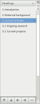
First of all, there would be no “content view” button anymore and categories would be handled by a more common drop-down menu. Thus, different categories could use specific views (graphics and tables could use thumbnails, comments could be color-coded by author, etc.) and show only relevant toolbar buttons (promote/demote and “headings shown” only under “headings”, “go to page” only under “pages”, etc.). There could also be an “All” category, which would show everything in a text-only tree view, just like now. This “All” category could also host the “Show content view” icon, for users who don’t want to use the menu drop-down.

Second of all, the “navigation” arrows would be merged with the ones in the scrollbar, and instead of the “navigate by” pop-up, the arrows would navigate by whatever category is selected in the navigator.

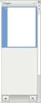
Third of all, a “Pages” category (“Slides” under Impress) would be added. It would work like a cross between the current slides pane in Impress and the navigator: you could use it to navigate the document, but also to drag pages onto the document to create a link to a page. The “Go to page” widget would appear on the category’s toolbar.

The “drag mode” button would reside in each toolbar’s ellipses menu (or, if there’s enough room for it, it could be shown directly on the toolbar). I’m not sure what to do with “Set Reminder”, “Header”, “Footer”, and “Anchor <-> Text”. They could appear in a second Navigator toolbar, one that’s not specific to a category (if this toolbar was there, it could also house “Drag mode” and “Search”). One or two of them could appear in the scroll bar, along with the navigation buttons (although we don’t want to overload the scroll bar). Or, if they’re not used that extensively, they could be bundled as an extension (think “Navigator+”) or appear in the ellipses menu.

What do you think?