UPDATE: Here’s a more current version.
—————————–
Hi everyone,
I still don’t have time to work on Citrus yet, but, as in the last days I’ve been getting many more hits than usual, here’s a list of all the important Citrus UI posts I’ve done so far:
 Citrus UI: the first post
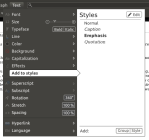
 How styles work + how menus look
 Managing windows through LibO menu (early prototype)
![]() Fizz: small toolbars that show up with selection
Fizz: small toolbars that show up with selection


Thank you. 🙂
I especially like how the menus look and work. And the small toolbar that show up with selected text.
Hey, your effort is just amazing! I’d like to know if you already coded it or still are in the development steps? Just look amazing!
🙂 Thanks.
Unfortunately, I can’t code, so this is all just a concept for now.
As the whole LibreOffice team is just getting ready to release the initial version (the design team is currently finishing up icons and branding), I expect UI discussions to take place right after the first release, when there’s a lot less time pressure. It’d be great if you joined the list.
Why have not released the beauty? 😀 it looks very very nice
I honestly think this is the way Libreoffice should go. Different and better.
Please let us know when coding begins… and please make them begin coding!
Be proud of your work and fight for it.
There will be many of us supporting you.
🙂 Thanks for your support.
The design/UI team is just kicking off — you can follow the progress here. I’m hoping that we’ll get to a UI overhaul with steps 6 and 7 and maybe a few UI fixes with step 5.
Hello I am working on a project to create a native gnome office suite work at the moment is focused on the word processor.
I was wondering if you would be interested in helping with the graphic design work along with the UI design work.
Please feel free to contact me
Kind Regards Dead Peasant
Hi,
I would definitely be interested in contributing. I don’t consider myself to have much artistic talent but I’ll help out where I can. 🙂
Thats great news feel free to contact me by email.
considering your blog is showing off a lot of pictures, perhaps you could:
1) choose a fluid theme replacement, which will let me absorb all the available space in the screen
2) once you’ve done that, you can replace with bigger thumbnails, which don’t mean I have to click/navigate each separate image
3) install a plugin which will let me lightbox the entire gallery of images
right now, it’s a pain to navigate and view each thumbnail. just saying as a potential improvement you could make in a half hour which would improve the wordpress blog a LOT