Since LibreOffice is not taking the same path as OpenOffice.org and won’t be adopting the Ribbonesque UI that came out of the Renaissance project, I have the opportunity to make some UI mock-ups.
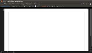
So, to start with, here’s a mockup of the default Citrus setup:
Quick summary: there’s a menu bar with different categories than there are now and there’s a search box on the same line — I’ll get to those in later posts. There are also a few buttons on the right of that bar — that’s where common contextual stuff that doesn’t apply to the current selection, like “Save”, “Paste”, “Undo”, and “Redo”, goes. And under that bar, there’s a toolbar with contextual stuff that depends on the selection. The ruler is now hidden by default. The zoom slider now has a place next to the horizontal scroll bar.
And that’s the jist of it.
I’ll be describing the UI as well as the reasons for the UI in follow-up posts.
UPDATE: First follow-up post: https://clickortap.wordpress.com/2010/10/15/the-citrus-menu/

Love your mockups. But useless! libreoffice already announced they will go the ribon way!!! to bad 😦 but then there is still ooo without ribbons
Really? When? Where?
I thought OOo was going the ribbon way…